H University: Logo and Brand Identity for an Education Brand
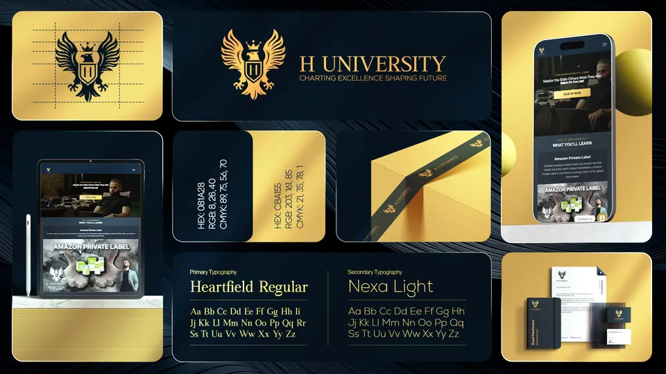
H University is an education brand whose crest is a gold eagle holding a shield, with the line Charting excellence, shaping future. Markit Media designed its logo and brand identity in navy and gold, shown with website mockups, stationery and a gold envelope.
- Logo & brand identity
1 piece shown. Artwork designed by Markit Media.
Project snapshot
- Client
- H University
- Industry
- Education
- Services
- Logo DesignVisual Identity
- Deliverables
- 1 logo and brand identity board
The identity
The crest is a winged eagle over a shield with the letter H, drawn in gold on navy, beside the name H UNIVERSITY in gold capitals and the tagline beneath. The board prints two colour codes, a deep navy and a muted gold, and names the typefaces, Heartfield Regular for headings and Nexa Light for text.
It also shows the identity applied to a tablet and a phone displaying a course-style website, a notebook and cards, and a gold ribbon wrapped around a box. The website screens advertise a course titled Amazon Private Label, which suggests an online learning brand, but the school's status, location and website have not been confirmed.
Logo & brand identity
1 piece from the H University identity presentation.
Showing 1 of 1 H University logo & brand identity
Explore more work


Want work like this for your brand?
Tell us what you need and we will point you to the closest relevant work.
Request a Quote →