Viva Diagnostics: Healthcare Logo and Brand Identity
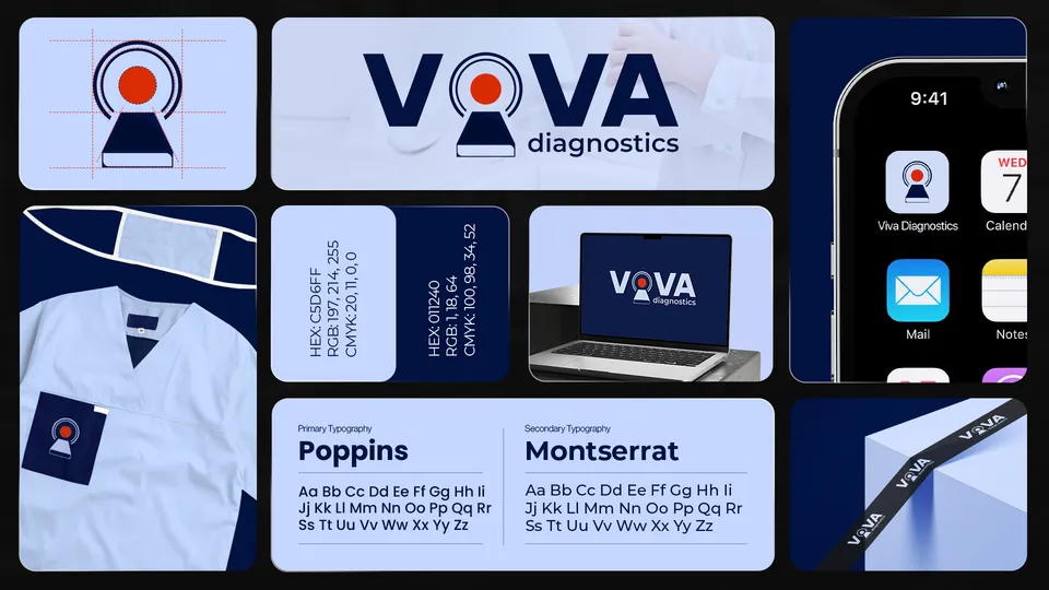
Viva Diagnostics is a brand whose logo places a red lens-like mark between the letters V and A. Markit Media designed its logo and brand identity in navy and pale blue, shown on scrubs, an app icon, a laptop and a ribbon.
- Logo & brand identity
1 piece shown. Artwork designed by Markit Media.
Project snapshot
- Client
- Viva Diagnostics
- Industry
- Diagnostics
- Services
- Logo DesignVisual Identity
- Deliverables
- 1 logo and brand identity board
The identity
The mark is a red circle inside concentric arcs over a small trapezoid, which reads as both a lens and a person, set between navy V and A letters, with the word diagnostics in a lighter weight beneath. The board prints a pale blue and a navy code, names Poppins and Montserrat as the typefaces, and applies the mark to a pocket on a set of scrubs, an app icon, a laptop screen and a navy ribbon.
The single red dot is the only warm colour in a cool system, which draws the eye to the centre of the mark. Location and website have not been confirmed, so none is named here. This page makes no health claims.
Logo & brand identity
1 piece from the Viva Diagnostics identity presentation.
Showing 1 of 1 Viva Diagnostics logo & brand identity
Explore more work



Want work like this for your brand?
Tell us what you need and we will point you to the closest relevant work.
Request a Quote →