Crescent Health System: Healthcare Logo and Brand Identity
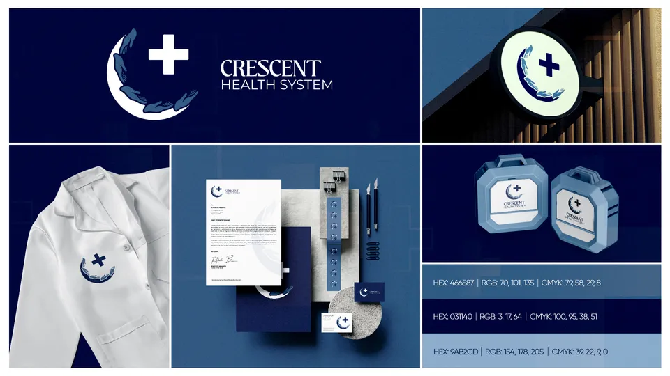
Crescent Health System is a healthcare brand whose mark is a crescent holding a cross, with a laurel at its base. Markit Media designed its logo and brand identity in navy, shown on a sign, a lab coat, stationery and two medical cases. It is a separate brand from Cheap Hardware Store (CHS).
- Logo & brand identity
1 piece shown. Artwork designed by Markit Media.
Project snapshot
- Client
- Crescent Health System
- Industry
- Healthcare
- Services
- Logo DesignVisual Identity
- Deliverables
- 1 logo and brand identity board
The identity
The mark is a white crescent moon with hands or laurel leaves along its edge and a cross inside, set beside the name CRESCENT HEALTH SYSTEM in white on navy. The board prints three blues, from deep navy to pale blue, and applies the mark to a round illuminated sign, a white coat, a letterhead with cards and two rugged carrying cases.
The cross and crescent together signal care in a way that is easy to recognise at small sizes. This page shows the design only and makes no health claims.
Logo & brand identity
1 piece from the Crescent Health System identity presentation.
Showing 1 of 1 Crescent Health System logo & brand identity
Explore more work

Want work like this for your brand?
Tell us what you need and we will point you to the closest relevant work.
Request a Quote →