
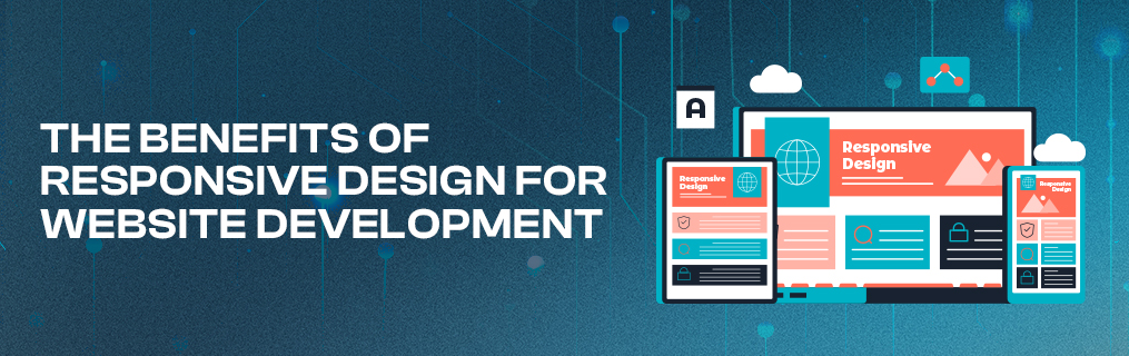

The Benefits of Responsive Design for Website Development
Meeting the Demands of a Mobile-First World
Responsive design has become a cornerstone of modern website development. As users access websites across a variety of devices, including desktops, tablets, and smartphones, providing a seamless experience is essential. Responsive design ensures that your website adapts effortlessly to different screen sizes and resolutions, enhancing usability and engagement. Here are the key benefits of incorporating responsive design into your website development strategy.
1. Enhanced User Experience
Responsive design prioritizes user experience by delivering a consistent and intuitive interface across all devices. Visitors can easily navigate, read content, and interact with your site, regardless of the device they’re using. Features like fluid grids, flexible images, and adaptive layouts ensure that elements adjust dynamically to fit the screen. A positive user experience leads to increased engagement, reduced bounce rates, and higher customer satisfaction.
2. Improved SEO Performance
Search engines, particularly Google, favor mobile-friendly websites in their rankings. Responsive design plays a significant role in search engine optimization (SEO) by ensuring that your site meets Google’s mobile-first indexing criteria. A single responsive site is easier for search engines to crawl and index compared to maintaining separate desktop and mobile versions. This streamlined approach boosts your visibility in search results and drives organic traffic.
3. Cost-Effectiveness
Building and maintaining a single responsive website is more cost-effective than creating separate sites for desktop and mobile users. Responsive design eliminates the need for duplicating content and updating multiple versions, saving time and resources. Over the long term, a unified approach reduces development and maintenance costs while delivering a consistent experience to all users.
4. Increased Mobile Traffic
With mobile devices accounting for the majority of global web traffic, responsive design is essential for capturing and retaining mobile users. A site that functions seamlessly on smartphones and tablets ensures that you don’t lose potential visitors due to poor usability. By catering to mobile users, responsive design increases engagement and conversions, particularly for e-commerce and lead generation sites.
5. Faster Page Load Times
Responsive design leverages modern optimization techniques, such as media queries and flexible grids, to ensure fast loading times across devices. Mobile users, in particular, expect pages to load quickly. A well-optimized responsive site improves performance, reduces load times, and minimizes frustration, all of which contribute to better user experience and higher search rankings.
6. Simplified Analytics and Reporting
A single responsive site streamlines analytics and reporting. Tools like Google Analytics provide a unified view of user behavior, enabling you to track metrics and performance across devices. This simplifies data analysis and helps you make informed decisions to improve your site’s effectiveness. With a consistent user journey, it’s easier to identify trends and optimize your strategy.
7. Future-Proofing Your Website
Responsive design ensures your website remains relevant as new devices with varying screen sizes and resolutions enter the market. Instead of building separate versions for each device, responsive design adapts automatically, providing a future-proof solution. This flexibility saves time and resources, allowing you to focus on growth and innovation.
8. Better Conversion Rates
A seamless experience across devices eliminates friction in the user journey, increasing the likelihood of conversions. Whether it’s completing a purchase, filling out a form, or subscribing to a newsletter, responsive design ensures that users can easily take action, regardless of the device they’re using. Higher engagement leads to better conversion rates and a stronger ROI.
A Necessity for Modern Websites
Responsive design is no longer an option—it’s a necessity for any website looking to succeed in today’s digital landscape. By enhancing user experience, improving SEO, and ensuring compatibility across devices, responsive design provides a comprehensive solution for website development. Investing in responsive design not only meets the demands of a mobile-first world but also future-proofs your site for long-term success. Prioritize responsiveness to deliver a seamless, engaging experience that keeps users coming back.